Hi! I'm a data visualisation developer at the Financial Times in London. I previously worked at Reuters and the Hindustan Times, and interned at WAMU 88.5, NPR, The Texas Tribune, and The Boston Globe in the U.S. after graduating from Northwestern University in 2017, where I was a Knight Lab student fellow.

When I'm not pushing pixels around or researching web accessibility, I'm into food documentaries, pop culture podcasts and making progress on my Goodreads challenge. Check out some of my work and projects below and drop me a line if you want to reach out!

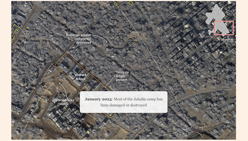
Golan Heights trenches

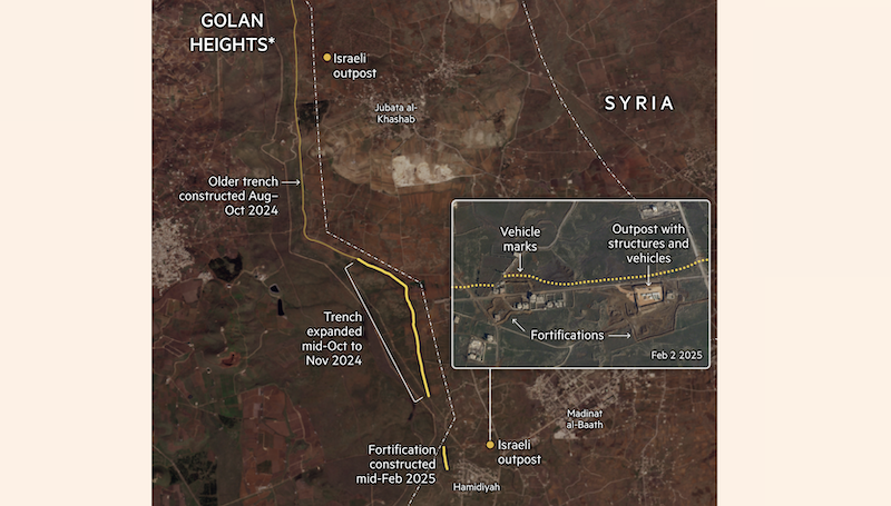
Analysed satellite images and collaborated with foreign correspondents to verify and supplement on-the-ground reporting on Israeli incursions into the Golan Heights and southern Syria. Identified new trenches, fortifications and outposts and produced two maps on a breaking news analysis timeline.

Jabalia Refugee Camp

Compared satellite images of Jabalia refugee camp and created a historical map using archive material, a scrolly graphic and static map annotating the progressive widespread destruction from Israeli strikes. Follows a previous project on the destruction of Southern Gaza.

BTS' ARMY

Interviewed BTS fans and experts, created the data graphics and designed and built the page. Won an Award of Excellence at the 2020 Society for News Design Digital Design awards, and BTS fans showed their love on Twitter.

South Asia data sources

Growing list of govermental, research and other sources of data about India and the South Asia subcontinent.

Self-care for Nerds

Pitched and gave a lightning talk at #NICAR17 about physical self-care as a developer, journalist, or just someone who sits at a computer all day. Here are my slides and speaker notes.

GIF-Making 101

It's no secret that I love GIFs. I led a workshop at the Knight Lab to teach students how to make GIFs using Giphy Capture and Photoshop.