India's North-South Divide
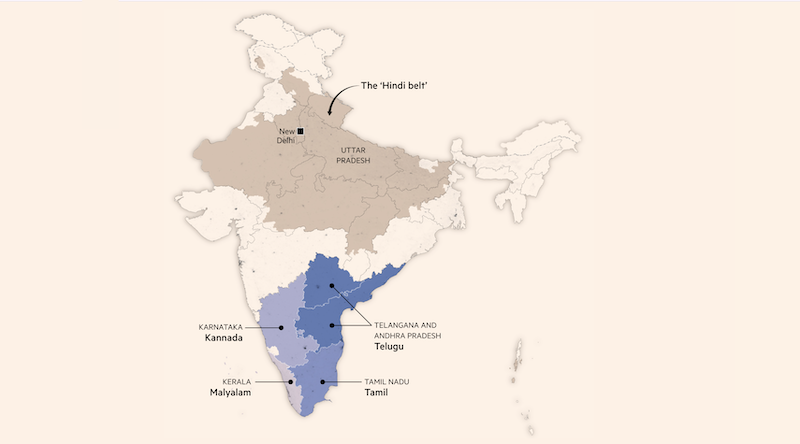
Researched and compiled socioeconomic and state finance data to create charts and maps illustrating the key points of this analysis piece on the divide between the northern and southern Indian states.
Researched and compiled socioeconomic and state finance data to create charts and maps illustrating the key points of this analysis piece on the divide between the northern and southern Indian states.
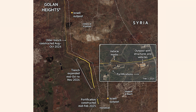
Analysed satellite images and collaborated with foreign correspondents to verify and supplement on-the-ground reporting on Israeli incursions into the Golan Heights and southern Syria. Identified new trenches, fortifications and outposts and produced two maps on a breaking news analysis timeline.
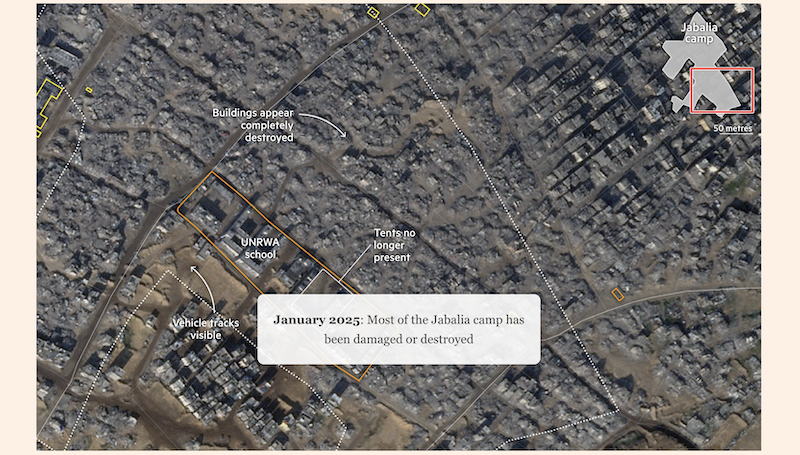
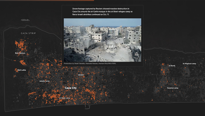
Compared satellite images of Jabalia refugee camp and created a historical map using archive material, a scrolly graphic and static map annotating the progressive widespread destruction from Israeli strikes. Follows a previous project on the destruction of Southern Gaza.
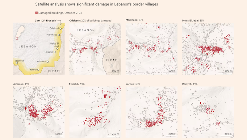
Compiled building damage data and satellite images to illustrate the extent of damage in towns and villages in Lebanon due to the ongoing conflict between Israel and Hizbollah. Follows prior satellite image analysis and graphics reporting on the damage caused to residential border communities in southern Lebanon and northern Israel.
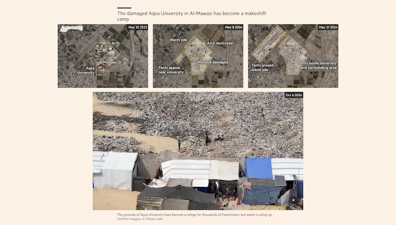
Analysed and annotated satellite images of Rafah and al-Mawasi in Gaza to visualize the destruction of buildings and dire living conditions for internally displaced Gazans during the first year of the war in Gaza.
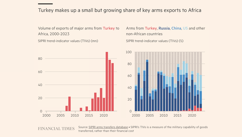
Collaborated with the West Africa and Turkey correspondents to pitch, research and design graphics for an analysis piece on Turkey's increasing interest in establishing its influence over the continent in the past decade.
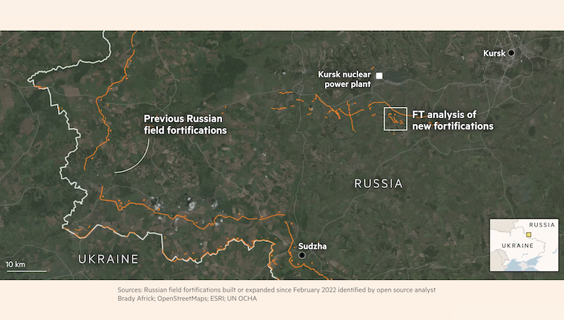
Analyzed satellite imagery and on-ground reporting to identify and new defense fortifications built in Russia to impede the Ukrainian army. Created a satellite map and a before/after comparison graphic to show the extent and the types of structures built.
Responded to breaking and ongoing news coverage and analysis of the first month of the Israel-Hamas war using the visual blog format combining visuals and text. A unique news challenge to produce continued graphics coverage at a time when data and information was scarce and difficult to verify, and relied on establishing a style guide and colour palette flexible enough to adapt to changing vectors of coverage.
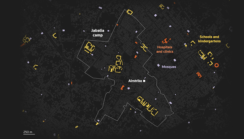
Compiled open source geospatial data, building damage analysis data and satellite images to visualise the scale of destruction to UN refugee camps in Gaza and the buildings at risk in Jabalia camp through maps.
Contributed to the visual production of the piece through writing, editing and compiling text, photos and videos from the wire to complement the scrolly map.
Researched and built graphics on nuclear power infrastructure and sentiment, interviewed a nuclear scientist and edited the scrolly graphic and illustrated graphics.
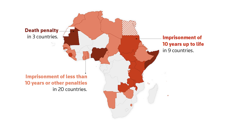
Expanded on breaking news coverage to explain current state of LGBTQ+ rights in African countries, drawing on recent data and historical context. I pulled on existing coverage from the Africa bureaus and original research to create several maps and charts.
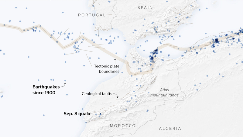
Breaking news page compiling maps, charts, satellite imagery and illustrations to explain why the 2023 Morocco earthquake was so deadly.
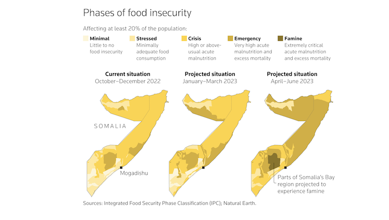
Collaborated with Reuters East Africa bureau to explain five major drivers of the Horn of Africa hunger crisis – woven through with one woman's personal story.
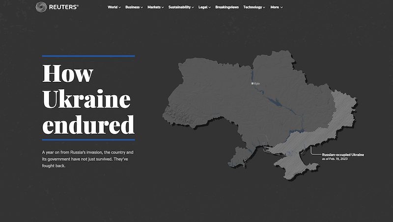
Worked with Ukraine coverage team to tell the story of Ukraine's endurance through the war with charts, maps and photos.
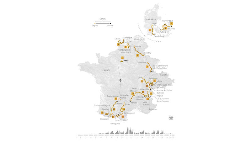
Project managed our annual graphics package for the fourth year running, with charts and maps in English and French! We iterated our workflow each year through automation and scripting; I wrote an Adobe Illustrator to handle the bulk of the map editing and used a Google Sheets template to streamline the translation editing process.
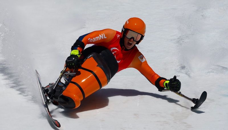
A visual deep-dive on the adaptive sports equipment Paralympic athletes use. I researched the history of disabled sport, interviewed equipment experts and athletes from Canada to Australia and in between, and designed and built the story.
Collected and processed data, and designed and built a graphic about the people killed in Myanmar’s military crackdown on protests after the 2021 coup, told through the stories of 7 victims. Won an Award of Excellence at the 2021 Society for News Design Digital Design awards, and was part of the finalist package for the Breaking News of the Year award at the Reuters 2021 Journalists of the Year Awards.
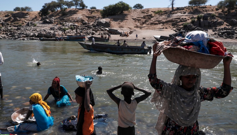
Collaborated with the Reuters East Africa bureau to narrate the death and displacement of hundreds of thousands of Ethiopians through maps, photos and original reporting. Recognised as part of Reuters' Ethiopia coverage with the Story of the Year award at the Reuters 2021 Journalists of the Year Awards, and a citation at the 2022 OPC of America awards.
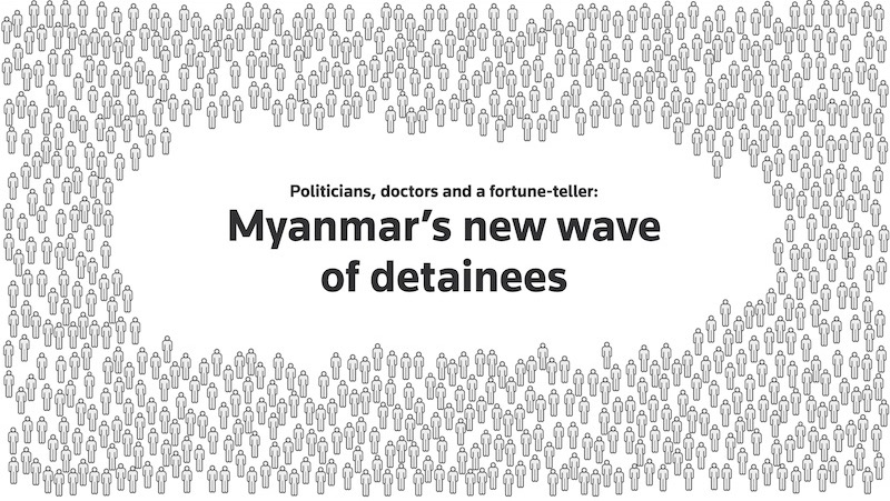
Worked with the Myanmar bureau to visualize the number of people detained following the military coup. Also tracked the reported gender, age and cause of death of the people killed by security forces.
Compiled reporting, photos and video and collaborated with a reporter to recreate and provide context on how the 2020 Ethiopia conflict unfolded. Designed and built the maps, scrolly graphic and page.
Interviewed BTS fans and experts, created the data graphics and designed and built the page. Won an Award of Excellence at the 2020 Society for News Design Digital Design awards, and BTS fans showed their love on Twitter.
Designed and built a scrolly reconstruction of how Wuhan gradually reopened its doors to the public. Illustrated an isometric city, recreated a Chinese health status checker and visualized China's coronavirus cases and testing.
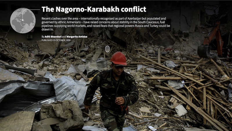
Created a scrolly explainer with annotated maps and photos to walk readers through the Nagorno Karabakh conflict and its impact on both local populations and international oil supplies.
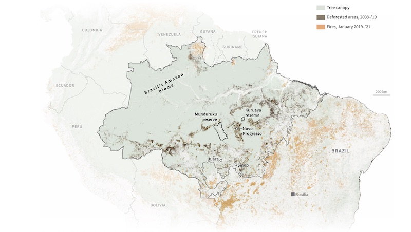
Wrangled QGIS to build a map showing the extent of deforestation and forest fires in Brazil’s Amazon rainforest.
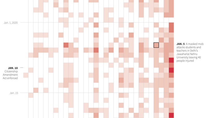
Visualized the demonstrations protesting and in support of the Citizenship Amendment Act that took place nearly every day for several months, and calculated the death toll and use of violence.
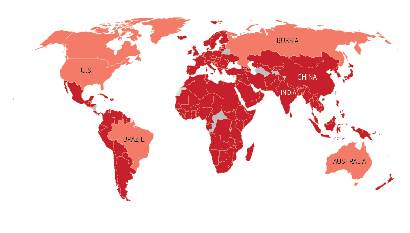
Collected data on and maintained a tracker of all the national and local school closures. Also available in Spanish.
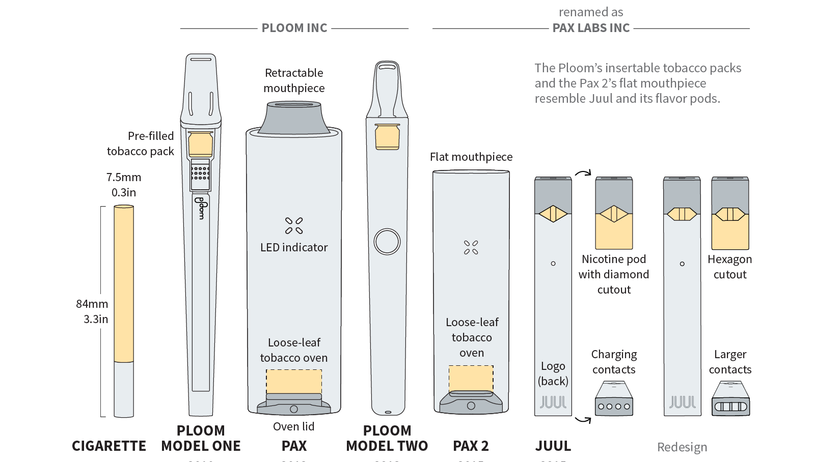
Made charts and illustrations based on research data and scientific patents for a Reuters Special Report on Juul.
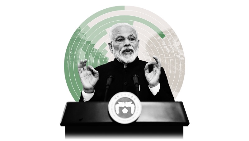
Collaborated with a reporter to assess progress on the Indian PM's previous election promises – sometimes with a chart.